|
Installing the
Name and Hailing Port
This page was last
updated on 29 April 2009
With only a few days
before launch, the time arrived to install the new name and port on the
transom. Technically (and superstitiously) I suppose we should wait
for an official renaming ceremony. However, that occurs in the
water, and I sure didn't want to put the name on with the boat in the water.
Some time ago, we
had decided on the typestyle for the name. Heidi had ideas, and searched
to find the font that matched the image in her head. It ended up being
Diner (at least in Word 2000). She wanted something that flowed, but
wasn't too script-y. I like it.
The only choice
for boat names is vinyl, in my opinion--it looks better, lasts longer, and is
easier to apply than paint. Plus, replacement of a damaged letter or
whatever is so easy. It's also less expensive. I went to my local
sign maker (Joe at Graph-X Signs in Cumberland, ME). I have purchased
several boat names from him before, and he also lettered my truck. However,
we ran into a small problem: he didn't have the Diner font on his
computer. I ended up loading the font onto a floppy disc and bringing it
over, and he was then able to load it onto his machine and incorporate it into
his graphics program. It sounds easy here, but this whole process took a
few hours spread over a couple days, between running around, searching for the
font on his machine, etc. It all worked out in the end, though, and after
a couple more days the cut vinyl was ready for me to pick up.
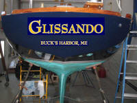
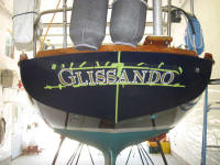
We chose gold
leaf with a white outline--a classic look. This means that the name comes
in two pieces--the white part, and the gold part. Combining the two pieces
was something I had not done before--other two-color graphics I have had done
were pre-assembled (so to speak) before delivery. Plus, I had wanted the
name cut on an arc. While I hoped for a small arc to remain when the name
was installed, the main reason for this was to accommodate the curvature of the
transom. If you put a flat piece of paper on a curved transom, the ends
come up, creating a dumb-looking upwards smiley curve. I wanted the name
to appear at least straight and level, with a slight downward arc. With
the chosen font, and the size desired, the vinyl paper was not large enough, so
Joe had to cut a few letters separately, for separate installation.
Describing this makes it all sound much more complicated than it actually is--it
seemed that way to me at first too. Once I got into the installation,
though, it was all clear. Read on.
Before beginning,
I laid the name and hailport out on a table and drew reference lines through the
vertical centerline, and a straight horizontal line between the "g"
and the "o" on the name--remember, the cut name was arced, so this was
the only horizontal reference there was. Joe had previously told me that
the bottom of the "g" and the "o" were level with one
another.
|
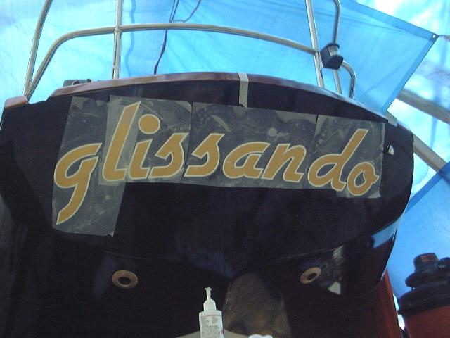
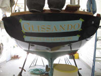
 First,
I taped the full white part of the name up on the transom and figured out the
proper positioning. This took some measuring, but more important was
eyeing it from several distances to see if it looked right. The name is
more visible through the paper in person than it shows in the photo. First,
I taped the full white part of the name up on the transom and figured out the
proper positioning. This took some measuring, but more important was
eyeing it from several distances to see if it looked right. The name is
more visible through the paper in person than it shows in the photo. |
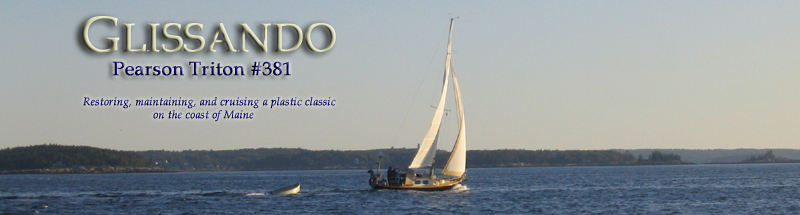
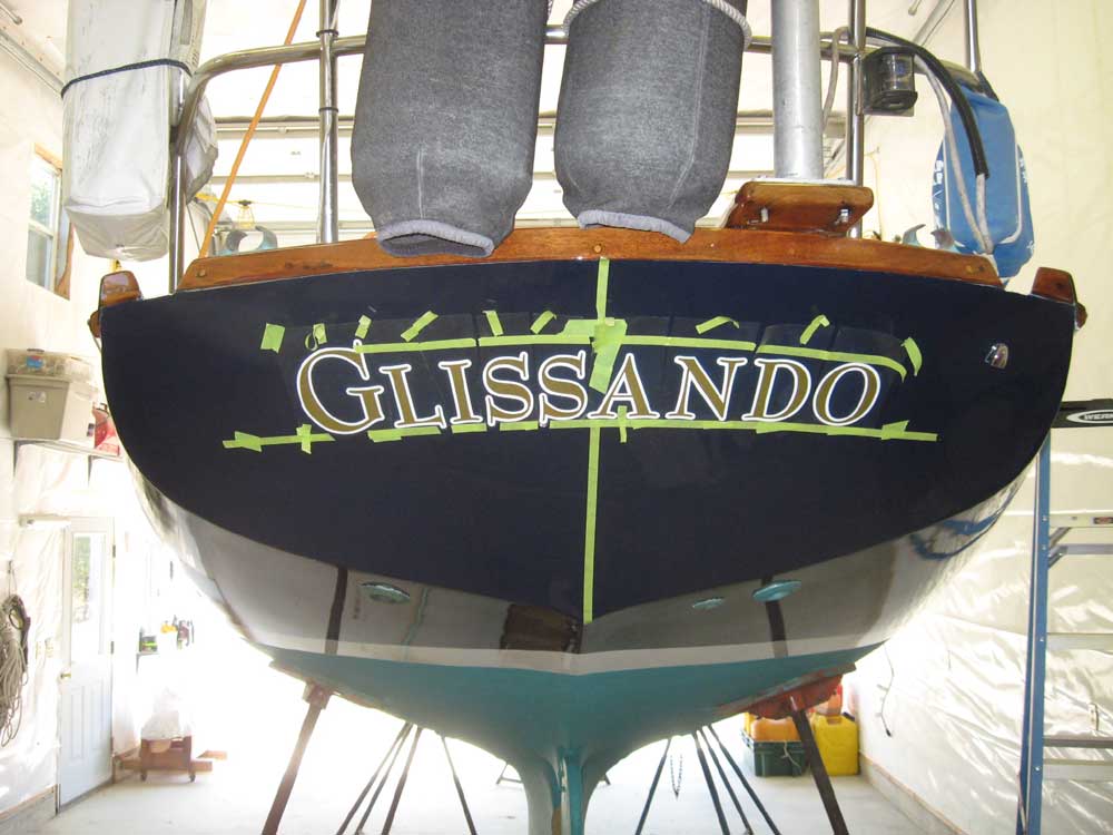
 When
I had the positioning right, I put some masking tape on the transom and made a
few reference marks for repositioning the name during installation. Then,
I removed the name and sprayed a transfer solution all over the transom
(basically soapy water). This allows the vinyl to be moved around and
repositioned as needed without it sticking instantly. I removed the
backing paper from the name and stuck it up, lining up the reference marks from
before. I had to do a little lifting and repositioning to get it
right. After a quick check of the position from the ground, I squeegeed
over the name with a plastic squeegee, pushing all the liquid and air from
beneath the letters. I did this a few times, ensuring that the letters
were firmly adhered. Note that the "g" is a separate piece--as
mentioned above, it was cut off a little on the first sheet, so a new
letter was cut, along with the "li", which were used to properly
position the "g". Before squeegeeing the "g", I
removed the cut one, and replaced it with the new one, as seen in the
photo. When
I had the positioning right, I put some masking tape on the transom and made a
few reference marks for repositioning the name during installation. Then,
I removed the name and sprayed a transfer solution all over the transom
(basically soapy water). This allows the vinyl to be moved around and
repositioned as needed without it sticking instantly. I removed the
backing paper from the name and stuck it up, lining up the reference marks from
before. I had to do a little lifting and repositioning to get it
right. After a quick check of the position from the ground, I squeegeed
over the name with a plastic squeegee, pushing all the liquid and air from
beneath the letters. I did this a few times, ensuring that the letters
were firmly adhered. Note that the "g" is a separate piece--as
mentioned above, it was cut off a little on the first sheet, so a new
letter was cut, along with the "li", which were used to properly
position the "g". Before squeegeeing the "g", I
removed the cut one, and replaced it with the new one, as seen in the
photo. |
|
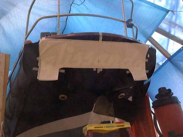
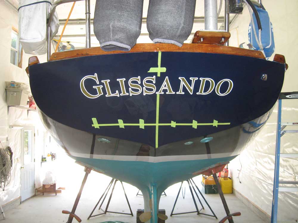
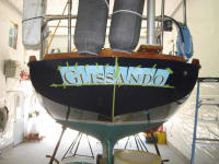
 After
a few minutes of drying time, I carefully removed the transfer paper, and then
went over the area and each letter with a soft towel to further press them into
place. Now the white background was done. After
a few minutes of drying time, I carefully removed the transfer paper, and then
went over the area and each letter with a soft towel to further press them into
place. Now the white background was done.
|
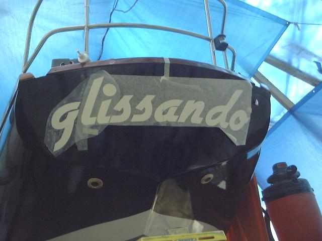
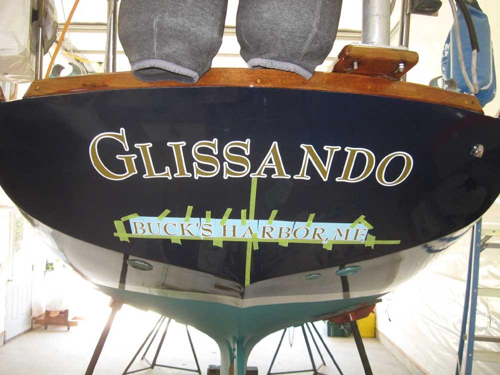
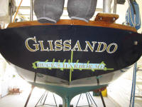
 Next,
I basically repeated the process with the gold leaf, although I cut the name
into manageable sections of 3 letters each. I sprayed the area with the
transfer solution, and positioned the gold on top of the white, leaving a consistent
thickness of outline showing on all sides. It was easy to move the letters
around as needed, so positioning was no problem. Then, I squeegeed each
letter as before. When all letters were on, I removed the clear transfer
paper after several minutes. Next,
I basically repeated the process with the gold leaf, although I cut the name
into manageable sections of 3 letters each. I sprayed the area with the
transfer solution, and positioned the gold on top of the white, leaving a consistent
thickness of outline showing on all sides. It was easy to move the letters
around as needed, so positioning was no problem. Then, I squeegeed each
letter as before. When all letters were on, I removed the clear transfer
paper after several minutes. |
|
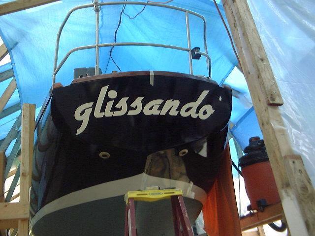
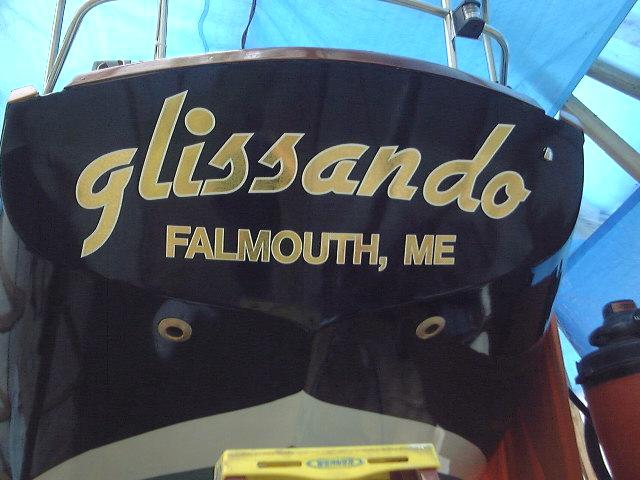
 With
the name complete, I followed the same basic process with the hailport. After
two applications, the port was complete. With
the name complete, I followed the same basic process with the hailport. After
two applications, the port was complete.
With the name
complete, the project suddenly seemed startlingly real, and close to completion.
|
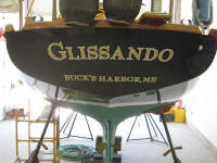
UPDATE: April 2009
After
repainting the boat during the winter, I needed to redo the
name and hailport. I made some changes this time to
update and improve the appearance, as well as reflect a
change in the boat's sailing location that had occurred
since the original graphics went on in 2001.
Earlier,
during the winter, I'd done some work online and found
several fonts that I liked, and dabbled around with a photo
of the boat's transom and some Photoshopping to superimpose
the various choices on the "boat". Eventually, we
narrowed down to one final choice.
|
 |
Several months went by
while I just couldn't manage to find the time to get to a
local shop to have the new vinyl made up. Eventually,
the pending launch date dictated that I get this done.
Armed with my printed mockups of the boat's transom and the
font I'd chosen (for which I didn't know the name), I
visited
Clark Signs and Graphics, which was about as nearby as
anything, and ordered the new graphics. It took a
couple emailed proofs and minor manipulations to get the
proposed look the way I wanted it, after which the new vinyl
was made up in short order by the friendly folks at Clark's.
Once again, I chose gold leaf vinyl with a white
outline--a classic choice. I chose a different look
than the original
graphics, which over time I had found I liked less and
less, and which I had generally always found to be too
large--my own fault for choosing the size in the first
place. I'd been threatening to make some changes to
the look of the name for years, but it never had happened,
as I kept thinking that "next year" I'd paint the boat, etc.
Plus, for two years I'd had the wrong hailport on the stern.
Well, this year I finally painted the boat, and the time
to change the graphics had arrived. This time I wanted the
name to be better proportioned to the size of the transom.
Additionally, I scaled down the size of the hailing port,
with no intentions (nor possibility) of documenting the boat
and therefore no need to use huge 3" lettering for the port.
Even though I'd spec'd the overall length of the new
name (about 30", which I determined after mocking things up
on the transom), when I picked up the vinyl it seemed tiny
on the table at the graphics shop. I worried briefly
that I'd made a mistake. Fortunately, when I got back
to the boat I could see that it was what I wanted and I
shouldn't have doubted myself.
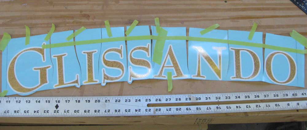
I spent a few hours
installing the vinyl. I'd simply ordered the vinyl cut
straight, without an arc, but to install on a curved transom
I'd need to do some layout to ensure that the name didn't
form a smile shape, which flat vinyl will do on a curved
surface. |
 |
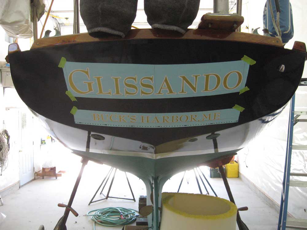
So I spent a bit of time
determining an appropriate location for the base of the
letters, and then marked out a baseline on the transom that
followed the slight curve of the deck camber above.
This gave the name a subtle arc when installed. To
make the letters follow the line I'd laid out, I cut the
vinyl mask between the letters as needed before installing.
I applied some tape to hold the letters in their general
arc, which was nice for taking a photo to show how
much a flat name needs to be curved to appear more or less
straight (or with a subtle arc) on the transom, but the tape
proved to be an annoyance during installation, as I needed
to manipulate the letters individually, and ended up cutting
the tape as I went.
Finally, I installed the name and
squeegeed it out. |
 |
Next, I
marked a similar line further down the transom for the
hailport. This time, however, I marked the baseline so
that it was level from side to side. After mocking up
and cutting the mask as needed, I installed the hailport as
well. |
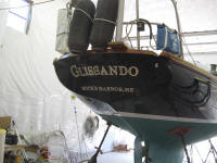 |
I went back and forth for
some time on whether to include an apostrophe in Buck's
Harbor. Observation over time had indicated that it
was common to see it both with and without the punctuation
on other boats' transoms, in cruising guides and other
writings, and in other sundry locations. Complicating
the inconsistency further was the fact that the NOAA chart
for the area indicated that it should be Bucks Harbor,
without the apostrophe. In the end, I chose to use an
apostrophe because all correspondence from the town and
specifically the harbormaster used it--if it's good enough
for the harbormaster, then I decided it would be how I
should spell it.
Such are the important issues
with which I wrestle.
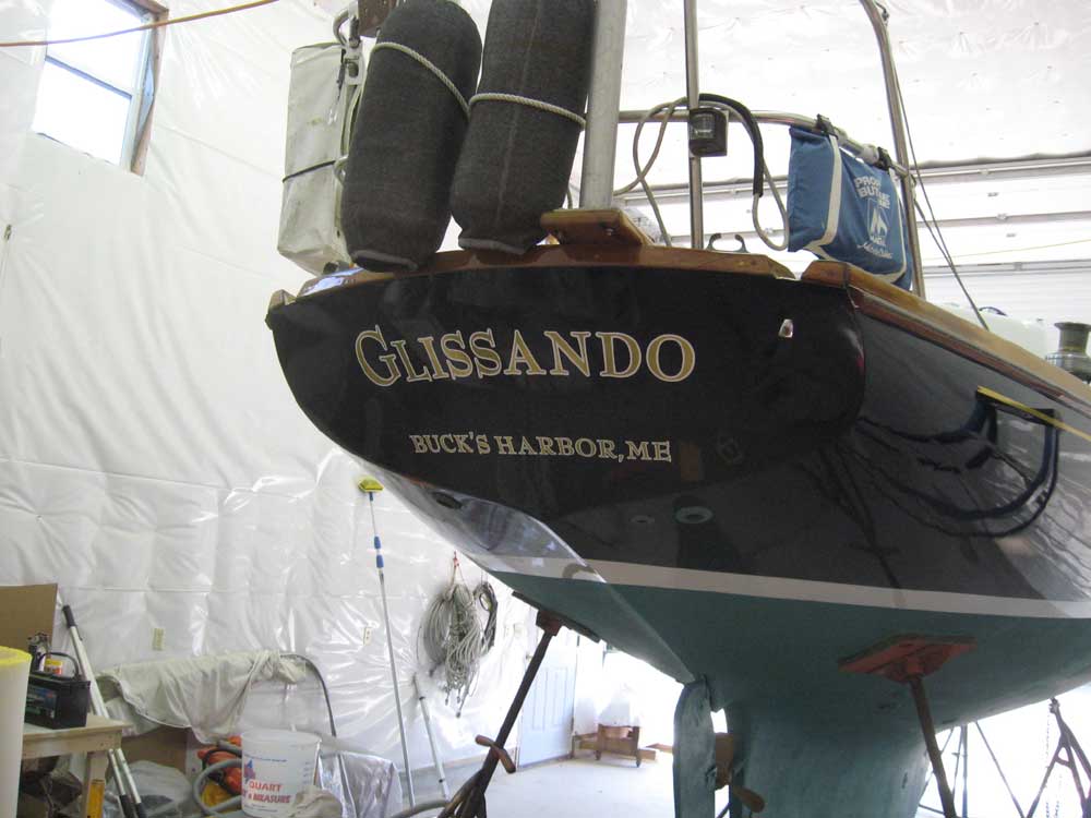
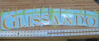
Here is a comparison of my
Photoshop mockup with the actual lettering. I will get
better pictures of the name once the boat is outdoors in
natural light. |
|
|
|
|